")

Designing mobile banner ads is, fundamentally, like designing anything else. It needs to look great, attract the audience it’s intended for, and ultimately convert. Previously, Bannerflow has written about the creative process behind designing a standard HTML5 banner ad. But how should your approach differ for your mobile campaigns?
If you use the Bannerflow creative management platform (CMP) then all your HTML5 banners are automatically optimised. All ads are responsive by default; meaning for a cross-platform campaign your ads will work on mobile, without the need to redesign and make changes. However, if your ads are going to be shown exclusively on mobile, you might want to consider taking a different approach to help you stand out from the crowd…
1. Keep it simple
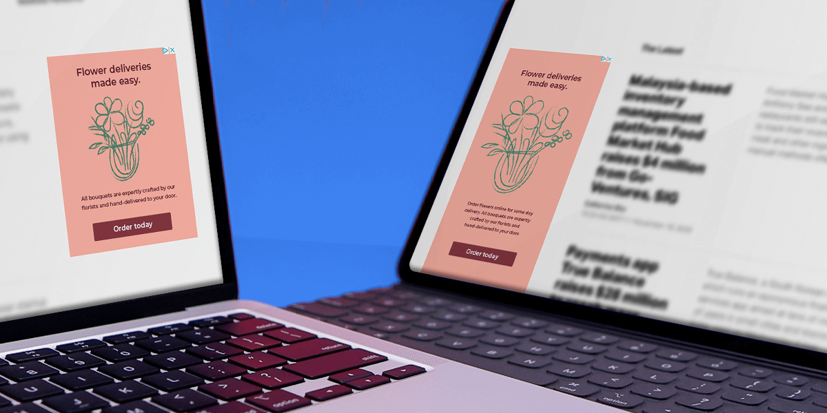
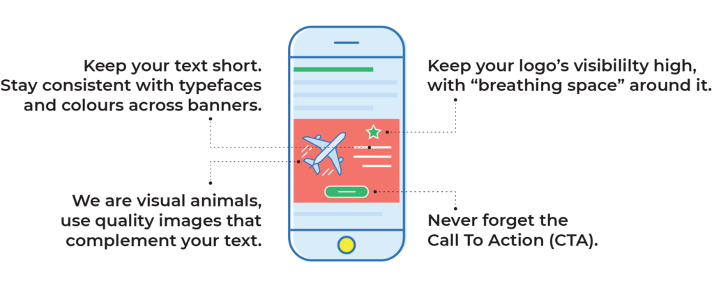
Banner blindness is less of an issue on mobile than desktop but there’s still no need to make your ads loud and brash.. You’re working with limited screen space, so you don’t want to annoy your audience by screaming at them, and assaulting their eyes with a visually busy banner.
Consider using a clean, simple design. Something that’s easy to read, which stands out without jumping. Of course, you need to stick to your business’ style manual, but think about using it in more of a minimalist way.
This approach will not only please your audience, but it will help raise the quality of banner ads in general. Plus, companies such as Google and Apple are now penalising intrusive display advertising – so better to be safe (and not annoy your viewers!)
The trick is to engage the user in a non-disruptive way. Even when you are designing a HTMl5 rich media ad, don’t intrude on the intensely personal relationship between the user and their mobile device. Instead embrace how users interact with mobile devices, you can still grab users’ attention – just with more finesse.
2. Concise copy
A lot of advertisers, particularly those with banners designed for desktop displays, fill their ads with copy. Lots of information about the product or service they’re selling is displayed over a background, or next to an image – and it can work. Some people want to know as much as possible before clicking on an ad, so it makes sense.
However, with mobile, this approach isn’t effective. Firstly, if you have a lot of text you can’t predict how it will look on every single screen size. Second, you only have, well, seconds to get attention. On mobile devices people tend to browse quickly, and skip over things of no interest, so if you’re asking them to read through lines and lines of text on an ad, the chances are they won’t.
For ads specific to mobile, you need to keep your message short and snappy. Have a clear message, but create enough curiosity for your audience to want to click through. Perhaps most importantly, be honest. Have a consistent message, and ensure that the landing page backs up any claim that the ad itself makes.
3. Mobile first
Now is the time to design everything mobile first. The truth is your display ad design – made desktop first – is more likely to be viewed on mobile in 2018. Throw out the old thinking of designing a campaign desktop first and then scaling down. Scale up from mobile! Display advertising has long gone mobile and now banner designers must think as such.
Ponder this: the physical act of browsing on a desktop is massively different to how you do it on your phone. You have to take advantage. As opposed to moving a mouse cursor and clicking, you tap, scroll and swipe.
Today it is best practice to build your banner sets mobile first, then scale your designs. This will help you create something which your audience naturally wants to engage with.
Browsing on a phone is interactive, so feed into that with interactive rich media banners. Using Bannerflow, for example, you can easily create a cube banner, where the user swipes to see different sides of your advert. This way, you as the advertiser can show multiple offers and products in front of the viewer. What’s more the user naturally wants to ‘play’ with your mobile banner ad, which results in increased engagement. Win win.
4. Silence is golden
As a savvy marketer, you’re probably using video banners, or in-banner video, as part of your mobile advertising mix. However, there’s one important factor that a lot of brands still don’t take into account: sound.
Why should you care? Well, most people using their phone at any given time are either already listening to something, or don’t want sound coming from the speakers as they’re in public. Traditional video ads rely on sound almost as much as visual messaging, which is an issue.
Today, creators make videos with no sound at all; these are tailor-made for mobile experiences. What’s more, the IAB when discussing auto play video banners, recommends the default setting for any sound should always be mute.
Everything must be conveyed through visuals. Plus, if you’re using auto playing in-banner video then that means you have a maximum 15 seconds to get your message across. Make those seconds count! Include a simple narrative, end with a clear CTA, and repeat.
And another thing… Any mobile video ad must not expand, unless initiated by the user. However, if the video banner is user initiated, the duration of the video is less of an issue, and the sound can be unmuted – think a trailer for a film. Again, make your mobile ads less invasive for the viewer, or easier to digest, and they will be more effective.
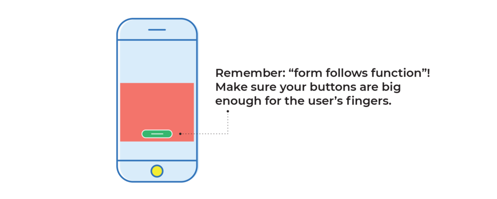
5. Big buttons
Finally, your buttons and CTAs need to be big enough to tap on, or swipe. They must also be relative to the ad, as people are pressing on them, rather than using a small mouse cursor to click.
Don’t make them too big, either! You want to avoid them taking over the entire display. They must big enough to press and draw the eye but not so big that they overshadow the message.
Remember, if you have access to a CMP you have the ability to optimise your buttons and CTAs through analytics. For example, use features such as heatmapping to see where viewers are tapping. Or use A/B testing to find the best performing button, CTA, or any other object for that matter! If you don’t optimise your mobile designs, it’s likely your competitor will be.
Summary: mobile banner ads
Designing mobile banner ads should be straightforward. Often the simplest idea will have the greatest impact. After all you have just a few seconds to grab your audience! By following these design tips, you have a basic understanding of how to create an engaging and successful mobile campaign.
One last point…For some unlucky designers the greatest barrier for designing mobile campaigns is the sheer repetitiveness of building the many different sizes needed for a campaign. The scaling of designs – even if you start mobile first – can be a chore.
Read our The ultimate guide to mobile banner ads here.
However, if you use a CMP like Bannerflow then you have all the tools you need to save time and get on with the most important part of building a mobile campaign: design. Why not get in touch and see how we can help you build better mobile campaigns?

")