")

You’d be forgiven for thinking that optimising a banner advert should be a relatively straightforward task. After all, you’re working with a limited amount of space, and you only have a few seconds to grab the attention of your audience.
Dig a little deeper though, and these are the exact reasons why you need to absolutely nail the optimisation. With the limited time and space, you need to be super efficient, and extra creative. Here are nine ways to help you fully optimise your banner ad campaign.
Position
People are creatures of habit. We get used to doing things a certain way, and continue on that path until something disrupts us, and is a demonstrable improvement over the previous way. It stands to reason then, that the way we look at websites and consume content doesn’t vary too much from person to person.
This means that the placing of your banner ad on a page is absolutely crucial. You need it to be in front of your audience’s eyes, so they naturally scan over it. Best placement for this is either at the top of the page or on the left. Your ad placement makes a massive difference to visibility, so always try to ensure you’re putting the banner in the best place.
Testing
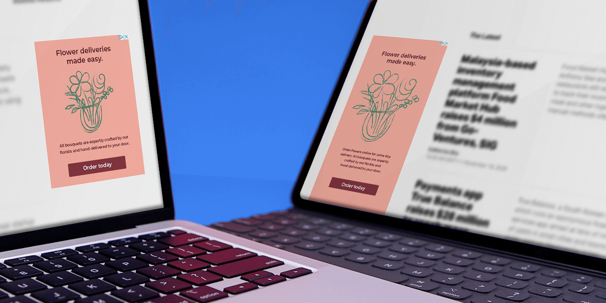
You can’t be certain any campaign is optimised, let alone complete, without doing some testing first. You can have two similar banners that have hugely different levels of engagement, just as the image below shows.
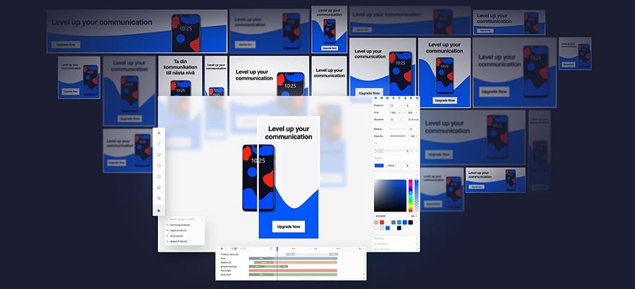
The variations in your testing should cover most aspects of your ad, but only change one small thing at a time. Otherwise, you won’t know which element is actually making the biggest impact. So make alterations to, for example, the copy first. Then once that’s tested, move on to the image, and so on. Then, you can be sure that your ad will be fully optimised
Quality of image
Your image or video quality in your banner ad will have a massive effect on your conversion, so you need to make sure it’s the best it can be. It’s the first thing the user will look at, so not only does it need to be a great representation of your offer or brand, it also needs to be interesting enough to encourage them to read the copy and click the CTA (call to action).
This means you need the image or video to be premium, designed specifically for your banner, rather than a stock photo or something captured on a phone. After all, you’re asking people to make the effort to view and click your ad, so you need to make the effort to optimise the way it looks. If everything is high quality, brand perception and awareness will rise as well. Win win.
Offer
How do you optimise a single offer if you’ve only got one specific thing in mind for your banner ad campaign? Well, it’s all about how you frame it. Which would you be more likely to click on out of these two?
Even though the first offer is mathematically better, the second sounds more appealing, and certainly more relatable. It’s simple, you’re getting 2 months free. It’s easy for the user to see the value proposition there, so they’re more likely to click. This is the focal point of your banner too, and will determine whether your audience is interested in clicking through, so you need to optimise.
Copy
A picture paints a thousand words, but with a banner ad, you need nail the copy that goes with that one thousand word picture. You only have limited space with banners, so your text must be brilliant. Of course you can keep it simple with two or three word CTAs, with action verbs, but it will always help if you can use a little text to conjure up an image in your user’s mind.
It can be simple, but evocative. How would they look in that jacket you’re selling? How would this device change their life? You only need a sentence to explain this, but it could be the difference between engaging your audience, or turning them away.
Colour
Colour can say a lot more about your brand and your offer than you may think. Again, this is all down to more general human behaviours and expectations, which have been moulded over years and years of conditioning. Of course, your banner needs to roughly match your brand colours, or at least use the same sort of pallette, but in order to optimise the ad fully, you need to keep in mind what you’re offering, and how the colours you use can help emphasise that. Here’s a look at how other brands use colour:
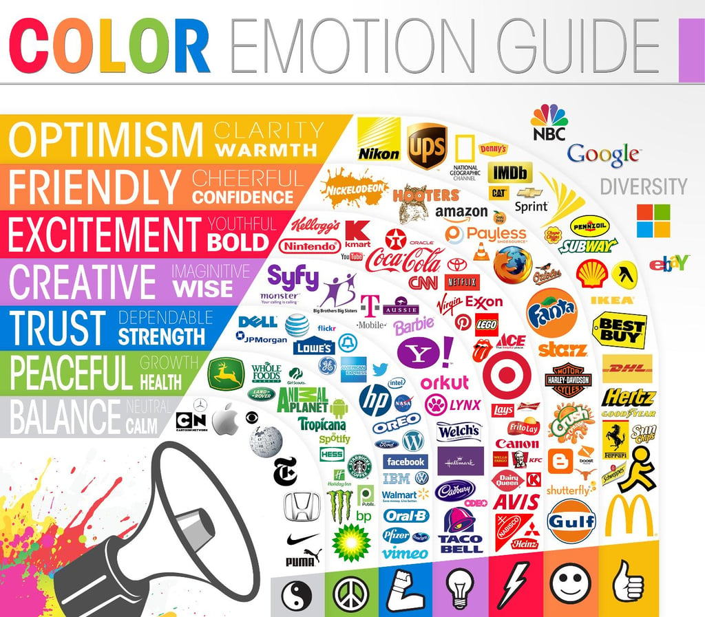
Image credit – Visme
You also should remember that you don’t want your ad to be too loud. By all means, use bright, bold colours, but just don’t make it too busy. A fully optimised banner will grab the attention of the user without having to beg for it.
Relevance
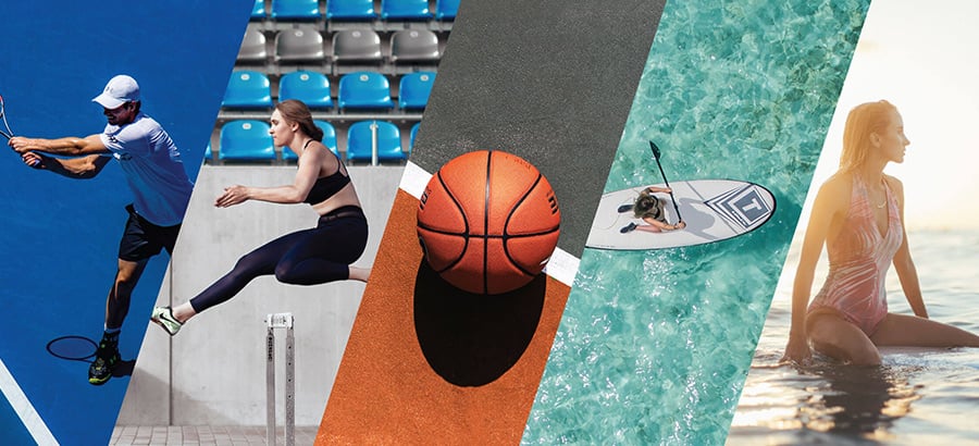
Your ad really needs to be optimised both for the audience you’re targeting, and the website it’s being shown on. When buying inventory, you should have a rough idea where your ads going to appear so you should try and make it as relevant to that page as possible. It makes more sense to try and sell a TV on a tech blog than on a fashion website, after all.
If you’re using retargeting, it’s less of an issue, as the ad will be served to the user based on their browsing history, but you still want to make the offer super relevant to your audience. In order to do that, you need to know who your audience is, and where to find them, and buyer personas will really help with this.
User flow
Your audience should be at the centre of everything you do with your banner ad campaigns. You need to think about making their experience as smooth as possible before you begin to think about your own conversions and click through rates. To do this, you need to optimise the path that the user will take.
Firstly, this involves making the banner as inviting and attractive as possible. From there, you need to think of where the user ends up after clicking, so you need a page which matches the tone of the banner, as well as having the offer at the front and centre. By all means, have other content on there, but you need to think about what the user wants and expects to see after clicking on your ad. That way, your conversion will be much better, and the user experience will be great too.
Think psychologically
In order to ensure your banner is fully optimised, you need to delve into the human mind a little bit. It’s fine having fantastic copy, but are you really tapping into the parts of the human consciousness which really drive a decision?
There are five things which really trigger a response – pain, emotion, fear, ego, and contrast. You should keep this in mind when writing your ad, and try and incorporate one of these drivers into your text. It should be subtle of course, so if you’re going for fear it should be more ‘you can’t afford to miss this offer’ and less ‘the world ends if you don’t click now’. So keep it relaxed, but just give it a thought when writing for your audience – what’s really going to make them tick?
Conclusion
There’s more to optimising a banner ad than meets the eye, but by following these steps you can ensure that your campaign is the best it can be. It may seem like a lot at first, but it’ll become second nature, and you can watch your engagement and conversion rise and rise.

")