Automate Your Creative Production
Have an idea in the morning and powerful digital campaigns live by the afternoon

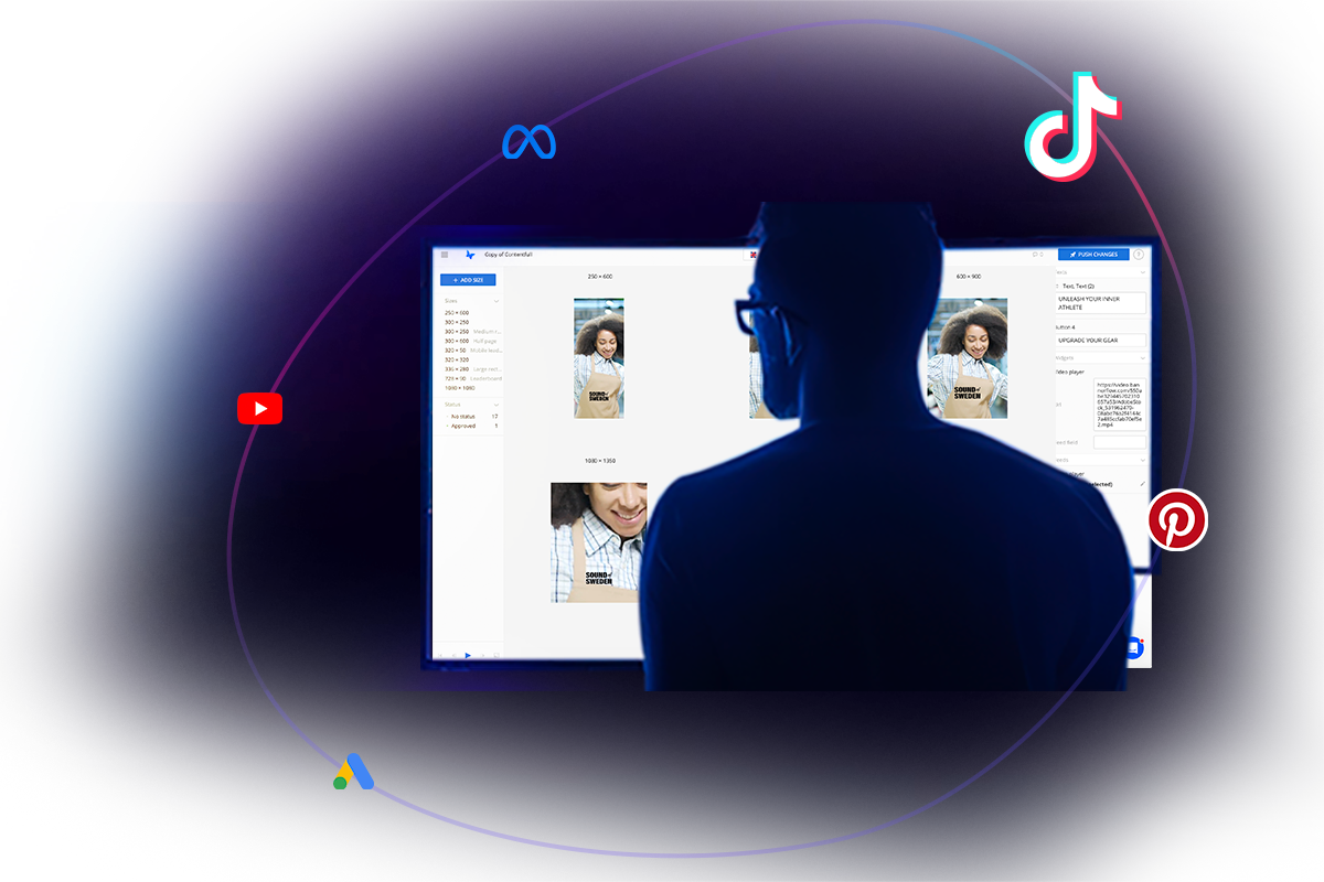
Boost your Social Ads with an Integrated Solution
Now with TikTok included
Introducing our streamlined solution: effortlessly create, scale, automate, and share your digital ads, now featuring viral TikTok assets. Streamline your advertising journey and gather all your social campaigns under one roof with ease.